Brand loyalty has become an extreme factor in consumer behavior, which means that brands need to be memorable to be competitive. This directly correlates to a brand’s website and website colors. The color scheme of your website needs to be attention-grabbing enough to keep viewers interested, but also align appropriately with the brand image and personality.
I wish there were some cut and dry explanation that said “These colors will make your brand successful. These colors will increase conversions on your website.” But, unfortunately, that’s not the case. There are so many factors that play into how your brand and color scheme are perceived and it’s all a careful balancing act to find that perfect color scheme that works for you.
While there is no end-all-be-all color scheme that is proven to work for all brands, there is a process that you can follow to select your website color schemes.
How to Build Your Website’s Color Scheme
1.) Determine how many website colors you want to use
You’ve got to start somewhere, so a good place to begin is determining exactly how many colors you want to highlight on your website. A good rule of thumb is to try to stick to 3 colors. This helps keep your website balanced and not too overwhelming, while still being able to grab user’s attention and focus them on the important aspects of your site. You will want to select the main “primary” color and then a couple of secondary colors to support it.
2.) Select the main primary website color.
The primary color should be aligned with your specific brand colors to maintain consistency and build off of any existing brand recognition. This is the color that you will use to grab attention and keep viewers interested in your website. It will be the main focal color of your website, used to highlight important information, calls to action, and other things that you want to stand out on your sight. So if the main color of your logo is bright, royal blue- this should be the primary color for your website. That way people who already associate that color with your logo will be able to recognize it on your website, increasing your brand presence.
3.) Select the secondary website colors
These are the colors that will be used in coordination with your primary color. There are many different methods and theories about the best way to select these colors, and I will get into that in a minute, but you want to keep in mind that these are the colors that are basically setting your main color up to bask in the spotlight. They should be good for things like headings, buttons, and to differentiate levels of importance for various features on your website. They need to still speak truth to your brand personality and the image that you want to portray about it. For example, if you want your brand to be warm, inviting, and calming and your main color is sherbert orange, bright neon green probably won’t be a great choice to convey that message as a secondary color.
4.) Keep neutral website colors in mind
While you will likely be focusing on the main primary color and a couple of secondary colors, it is important to know what neutrals you will be incorporating into the site. For example, at webFEAT, our main colors are bright blue and green, with pastel blues and greens as secondary colors. But we also utilize a LOT of white on our website as well as a neutral to help balance things out.
How to select your website’s secondary colors:
This is often where things get tricky and overwhelming. There are so many different colors to work with and each conveys a different message and tone. Understanding color theory can be very complicated and hard to wrap your head around. Thankfully, this article by Design Wizard, Understanding Color Theory, gives a high-level overview and outlines key points that you need to know in order to understand how colors work together to generate emotions and feelings.
In a nutshell, you want to choose your secondary colors to lift up your primary color and support the message it is trying to send.
Some brands choose to go with secondary colors that directly complement the main brand color. For example, if your primary website color is royal blue, choosing a nice pastel blue and a navy blue as secondary colors would directly complement the main website color.
Other brands focus more on stark contrast with their secondary colors. To go along with the example of the primary website color being royal blue, secondary colors that would provide contrast might be a pale yellow and a pale coral. They would contrast the bright royal blue and support it, making sure it stands out the most.
Studies such as The Aesthetic Response to Color Combinations and Consumer Preferences for Color Combinations have shown that consumers tend to prefer color pallets with similar hues (think: all colors in the palette having a blue/green tint), while similarly gravitating towards palettes with a high contrasting accent color (think: pallets with secondary colors having a blue/green hue and the primary color being a shade of red).
We’ve come to the point in the post where I think you’re ready to be introduced to one of my best friends: The Color Wheel. The Color Wheel is a visual representation of all colors in the visible light spectrum displayed in a way that makes the most sense to the human eye. It helps people put together the various forms of color combinations that are available.
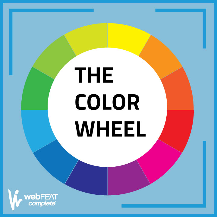
There are tons of different ways that you can combine colors in an appealing fashion, but the 3 standard types of color combinations that end up being the most eye-pleasing are complementary, analogous, and triadic.
Complementary Colors
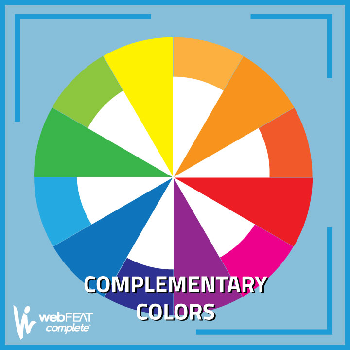
If you’re looking at a color wheel, like the one pictured below, complementary colors are colors that are opposite of each other on the color wheel. These kinds of colors are great for brands that are bold and dramatic, inviting lots of contrast into their color schemes.
Analogous Colors
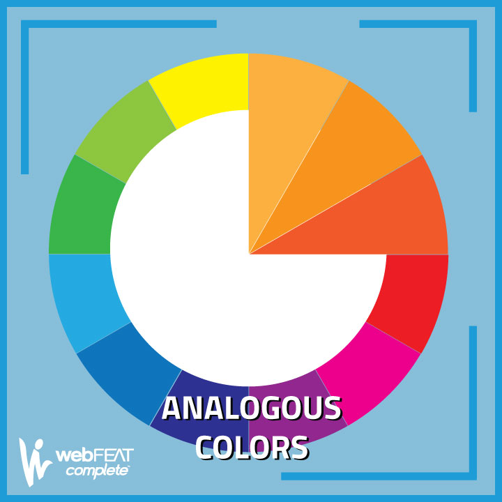
Analogous colors are colors that appear next to each other in the color wheel, like the group of red/oranges pictured. Choosing analogous colors for your secondary color could be good for brands wanting to appear steady, and consistent.
Triadic Colors
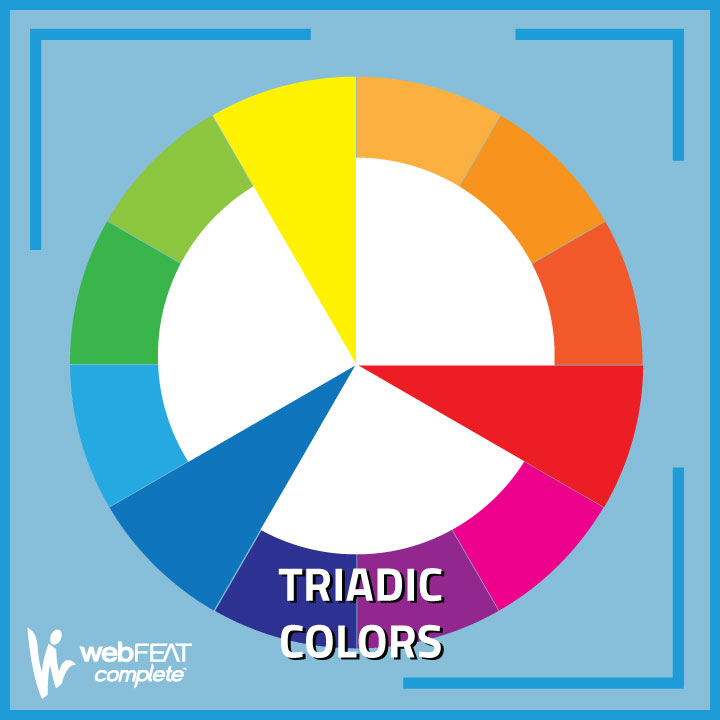
Triadic colors are ones that appear equidistant from each other on the color wheel and are evenly contrasted with one another. In the photo example, you’ll see the 3 standard “primary” colors of red, yellow, and blue. The 3 standard “secondary” colors green, orange, and purple are also considered triadic colors. Because the colors are so different, triadic colors are good for big, explosive vibrant brands.
The most important thing to consider when selecting your secondary (and primary color for that matter) is whether or not those colors represent your brand and the personality you want it to take on. Your colors themselves become entities of your brand and those will be what some people singularly think of when they think of your business and your business’s website.
Let’s say you’re launching a line of organic skincare products and your brand’s personality to be natural, gentle, and soothing. It’s probably not a great representation of your brand to make the primary color bright red, and complementary colors yellow and orange. All of those colors are fun and vibrant and exciting, but none of that conveys the personality that you were trying to give to your brand.
Website Color Selection Resources
If you’re looking for some resources to help you come up with your website color scheme, we’ve put together a list of websites for you. These tools will allow you to enter your main brand color and, based on different specifications in the tools, will generate various color groupings that could pair well with that color.
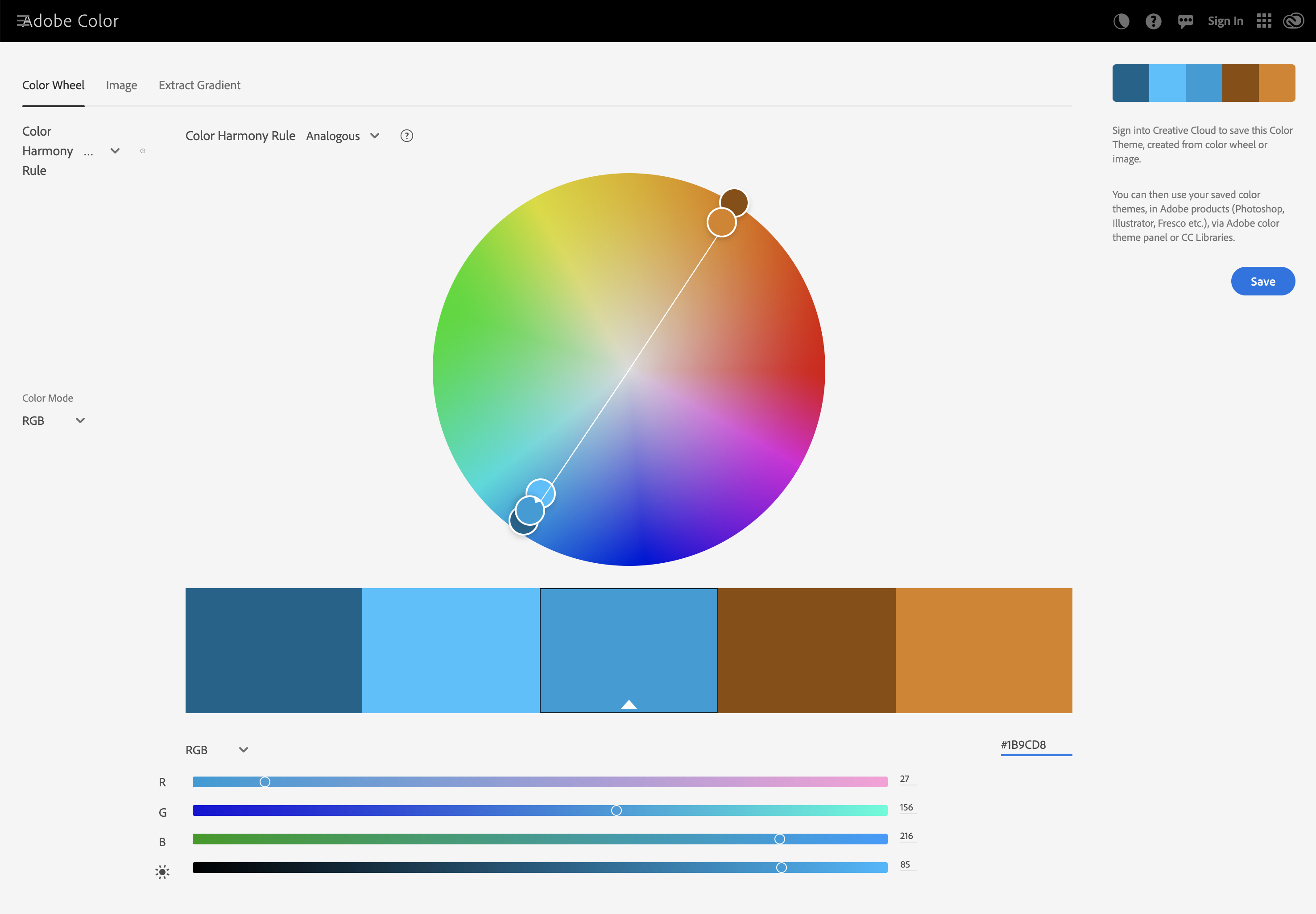
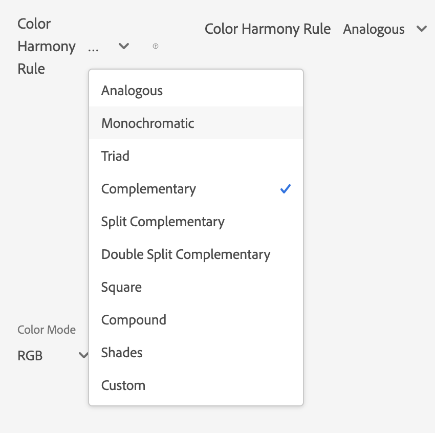
1.) Adobe Color: Link to website
This tool allows you to see all different color combination options to pair with your primary brand color. You can enter your brand color into the generator, select which kind of color scheme you want (complementary, analogous, triadic, and more) and it will generate a palette for you
. 
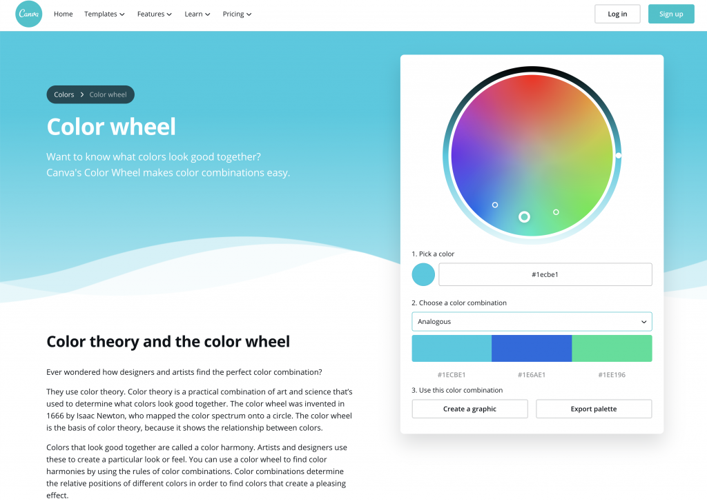
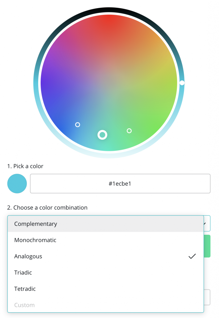
2.) Canva: Link to website
Very similar to the Adobe color tool (and maybe a little less overwhelming), Canva offers a great resource to select complementary, analogous, triadic, and other various color combinations stemming from your original brand color. Once again, you are able to enter your brand’s color (hex value) and the generator will come up with colors that pair well with yours.
Color Mind: Link to website
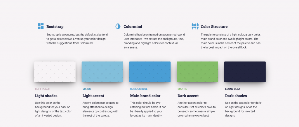
This tool is geared towards website color schemes specifically. It is good if your company has multiple primary colors (for example, at webFEAT we have two- blue and green). You are able to enter in all of the color values that you have already come up with, and it matches you with other colors that will work well with those colors on your website. Once your palette is generated, it gives you details on where you should use each color on your website.
 .
. 
As far as color theory and color perception go, we could probably fill an entire website with blog posts about how all the colors work together to create and express emotions. Ultimately, you should choose the colors that feel right to represent your business and your brand. If you’re putting a message out into the world with the colors that you choose that resonates with your business, consumers will resonate with it as well.
If you need help developing a website for your business, reach out to our team. We would love to get discussing how your website (and your website’s color scheme) can have a major impact on how your business achieves success online.
“”


