When first encountering a web page, it only takes a few milliseconds to develop a gut feeling as to whether or not a user wants to remain on the site.
Let me guess— when you first met this page, your eyes glanced at the main image, then over to the title, then to my byline, then probably over to the bolded definition I’m about to discuss below.
This is because a users’ eyes follow a predictable path that essentially has to do with the physiology behind the human eye itself. Because we are all susceptible to this predisposed visual path, you must implement a visual hierarchy to your web design. Without establishing one, a user’s eyes could easily skip over the most important components you’re trying to highlight.
If you’re not familiar with this concept, here’s the simple definition:
Visual hierarchy refers to the arrangement, size, color and contrast of visual elements. It determines their relative prominence and the order in which they are seen by the human eye.
By implementing practices of visual hierarchy deliberately, you can actually guide a user’s attention through a series of messages and towards the intended call to action.
At a glance, visual hierarchy ranks your objects in order of importance. Whether you’re developing a site, creating an advertisement, or sending out an email blast, every interface has a visual hierarchy— even if you intended it to or not.
However, having no set hierarchy can result in two kinds of user audiences:
-
- Confused: The user tries to take in all of the content at the same level of importance and leaves confused, without actually digesting much of the information. They bounce around all of the “parts” without ever getting the “whole.”
- Moved On: The user sees everything at the same level of importance, so they don’t even try to guess at what you are trying to tell them. They pass up the “parts” because the “whole” doesn’t inform them where to start or how to get around.
This is why it is so important to establish some type of hierarchy in all types of web design. Regardless of continually changing user interfaces, the way we see and perceive visual information will remain the same.
Designer or non-designer, small business or big enterprise, these simple methods can help capture the attention of an audience and help gain the conversions you’ve been aiming for.
FIRST, UNDERSTAND A USER’S VISUAL PATTERNS.
Back to the science behind your eyes:
All cultures read from top-to-bottom and most cultures read from left-to-right. Even though that knowledge is important for web design, designers know the task is much more complex than that.
Users don’t read web pages, they scan. Scanning means they only stop to read when something catches the eye.
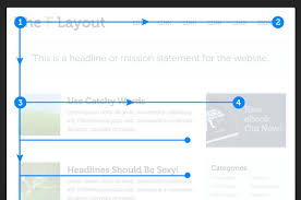
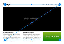
Recent studies have shown that people first scan a page to get a sense of whether they are interested before they commit to reading it. Scanning patterns tend to take one of two shapes, “F-shaped” and “Z-shaped.” When designing a layout, you can easily take advantage of this knowledge.
F-patterned scanning is typically for more text-heavy web pages, while Z-patterned scanning is for designs that aren’t centered on text.
Web designers generally construct their landing pages to conform explicitly to this the Z-patterned behavior, placing the most important information in the corners and positioning other important information along the top and bottom bars (connecting diagonally).
HOW TO BREAK THE CONFORMITY OF VISUAL PATTERNS
Remember, without establishing a visual hierarchy, a user’s eyes could easily skip over the most important components you’re trying to highlight.
Now that you have knowledge of visual patterns, I’m going to tell you how to redirect a user’s attention from their unintentional scanning methods. There are eight important characteristics to developing a design that are actually strong enough to override this tendency to scan pages in a certain pattern.
The importance of each individual component in your design can be manually “ranked” by manipulating these characteristics:
-
- Size – Users notice larger elements more easily.
- Color – Bright colors typically attract more attention than muted ones.
- Contrast – Dramatically contrasting colors are more eye-catching.
- Alignment – Out-of-alignment elements stand out over aligned ones.
- Repetition – Repeating styles can suggest content is related.
- Proximity – Closely placed elements seem related.
- Whitespace – More space around elements draws the eye towards them.
- Texture and Style – Richer textures stand out over flat ones.
*Combining any of these characteristics will multiply their effect.

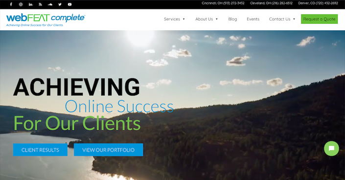
Take a look at our homepage above. It follows a classic structure for Z-patterned scanning. However, the combination of the size and alignment is why your eyes are immediately drawn to our slogan, “achieving online success for our clients.”
Your eyes are also going to quickly navigate to our call to action buttons. Their contrasting colors make them stand out, but so does the repetition of the rectangular shape. They are subtly drawing in the attention of the user, which consequently can lead to the subpages of our site.
Let’s try another example.

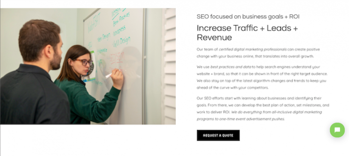
This page is a good example of a web page that would provoke F-patterned scanning because it is very text-heavy. Yet again, the manipulation of some of our eight design characteristics is what’s going to help redirect the user’s attention where we want it to.
Though we read top-to-bottom, the manipulation of the size of the heading “Increase Traffic + Leads + Revenue,” is going to direct your vision there prior to reading the heading directly above it. Then before you begin skimming the paragraph directly below, your eyes are going to once again jump to our call to action buttons because their color is creating contrast on the web page.
PRO TIP: Use people pictures
Faces are uniquely powerful imagery. From the time we are born, we gaze at faces more than anything else. The magnetic power of people pictures is very useful in web design.
Not only do faces draw attention, but they also correlate with the conversion. The famous case study by Basecamp showed a huge lift in results when faces and testimonials were combined on a sales page.
Think of it this way, it’s good to differentiate your brand, but the layout isn’t the place to do it. We are physically made to view objects in certain ways. Be different in WHAT you say when designing, but be typical in HOW you design your message.
Brand-new, high-end, luxury cars look amazing compared to older and beat-up models. However, every car is still going to have doors on the sides, wheels on the bottom, and headlights in front.


